How We Design the Conversion Layer of Your Content Product

In the previous article, we looked at informational architecture — how your hub helps people learn.
This next layer focuses on what happens after that.
How do people move from learning to engaging, subscribing, or reaching out?
This is where many hubs break down.
What conversion architecture means
Conversion architecture is how your hub guides someone toward meaningful next steps.
The key word is guides.
Not pushes. Not forces.
In trust-led B2B, people do not all convert:
at the same speed
in the same way
on the same page
So your job is not to create a single path.
It is to create multiple sensible paths, without making the experience feel busy or aggressive.
The common mistake to avoid
Many teams follow “one page, one CTA.”
This often leads to:
missed opportunities for engagement
dead ends after reading
forcing users into actions they are not ready for
A better approach is:
one page, one primary purpose — with several relevant next steps
This keeps the page focused, while still giving people options.
How conversion should work in practice
A well-built hub creates a natural flow from learning to action.
The typical journey looks like this:
someone arrives from search, social, or outreach
they land on a blog, guide, or category page
they learn something useful
they are offered relevant next steps
they choose a deeper level of engagement
That next step might lead to:
a subscriber
a webinar registrant
a resource download
a direct inquiry
This is what “multiple paths of conversion” really means.
Not random popups.
Not five competing buttons.
Not forcing everyone into a demo.
What these paths can look like
Good hubs connect content in a way that builds commitment gradually.
For example:
a blog leads to a checklist
a checklist leads to a webinar
a webinar leads to a case study
a case study supports a contact request
Or:
a category page helps someone choose their own path based on interest
Each step feels like a continuation, not a jump.
Every page needs a clear next step
A content page should never feel like the end of the journey.
Instead of stopping at “thanks for reading,” include quiet prompts to continue.
A strong page often includes:
a contextual CTA near the top (if relevant)
one or two mid-page modules tied to the topic
a FAQ section to reduce hesitation
an author or expert section to build trust
related content at the end
a softer option like newsletter sign-up
a stronger CTA at the bottom for high-intent users
The key is relevance.
Each prompt should feel connected to what the reader is already doing.
Use primary and secondary CTAs
A simple way to structure this is to separate intent levels.
Primary CTA
Example of a subtle primary CTA leading people deeper into a topic with a downloadable resource.
The best next step for someone who is clearly engaged.
Examples:
download a related resource
register for a webinar
view a template
explore a deeper guide
Secondary CTAs
Example of an above-the-fold soft CTA to sign up for regular updates.
Lower-pressure ways to continue.
Examples:
read another article
browse the hub
subscribe to updates
explore the author’s work
This keeps the page useful for both high-intent and early-stage visitors.
Build bridge pages
Example of a bridge page shown after someone downloads a resource.
When someone is ready to take a step, the experience should still feel helpful.
This is where bridge pages come in.
A good resource or download page connects:
the problem the user has
what they have just learned
the resource being offered
the action you are asking them to take
Instead of sending users straight to a bare form, include:
a clear headline tied to a real need
simple, concrete outcomes
a short form
trust signals (e.g. credibility, proof)
additional content below for those who want more
This makes the transition feel natural.
Category pages also drive conversion
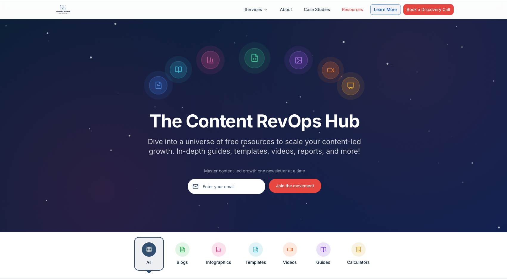
Example of a /resources page with sorting and conversion capabilities.
Your homepage and category pages are not just navigation tools.
They help people self-sort based on what they need.
A good hub allows different users to choose their own path:
some want articles
some want templates
some want webinars
some want case studies
some want to speak to someone
Your structure should support all of these without friction.
Design plays a key role
Conversion is not just about what you say.
It is also about how the page feels.
The goal is to create a calm, guided experience.
That usually means:
clear structure and hierarchy
well-defined sections
modular, contextual CTAs
consistent layout across pages
enough space to avoid overwhelm
Avoid:
aggressive popups
full-screen interruptions
constant prompts
unrelated CTAs
cluttered layouts
The page should feel helpful, not transactional.
A simple test
Ask yourself:
Does this page help someone understand what to do next?
Or does it just ask them to convert?
If it only pushes conversion, it will feel thin.
If it only teaches and never guides, it will feel passive.
You need both.
The guiding principle
The tone of the experience should feel like this:
here is what this is
here is why it matters
here is what to explore next
here is a useful resource if you want it
here is how to go deeper when you are ready
This is how trust-led conversion works.
The takeaway
Conversion architecture is about balance.
You are not trying to capture everyone immediately.
You are creating a system where:
learning leads naturally to action
different users can move at their own pace
engagement feels earned, not forced
When done well, the hub does not feel like a funnel.
It feels like a guided path forward.