Life science marketing statistics 2026
Request a content audit: score your own content presence, conversion architecture, distribution, and AI-search readiness against these benchmarks.
Book a CallThe figures below come from watching what life science companies actually built. Every one carries the group it was measured on, and where the source does not publish a base or a sample size, the page says so. A percentage without a denominator cannot tell you whether you are ahead or behind, which is the first thing we fix when we take on content marketing as revenue infrastructure rather than as output.
Part of Content marketing for life sciences, the complete guide.
Key takeaways
- About 48% of life science companies maintain an active content presence. Base: roughly 2,000 companies.
- About 22% publish nothing that helps somebody choose a vendor. Same base.
- Comparison pages appear on about 1.8% of active-cohort sites, and ROI calculators on 0.6%.
- Distribution scores 1.72 out of 4, the lowest of the eight maturity dimensions. Base: the active cohort.
- Median organic traffic at $10M to $50M revenue is about 360 visits a month, on a 500-company pharma and biotech sample drawn from a population roughly 90% of which publishes nothing. This is not a benchmark for a company that publishes.
- Average organic traffic runs 3.6x to 8.9x above the median in every revenue band. Same base.
Where these numbers come from, and who produced them
We publish this research, and we sell content marketing services to life science companies. Read the figures with that in mind.
They come from two studies we ran.
- The State of Content Marketing for Life Sciences 2026 covers roughly 2,000 companies across biotech, pharma, MedTech, diagnostics, and the CROs and CDMOs that supply them, collected in the first half of 2026.
- The State of Content Marketing in Pharma 2026 covers 1,994 pharma and biotech companies drawn from a Crunchbase dataset.
Four things about that, stated once here rather than repeated beside every table.
We observed rather than asked. Most figures come from reading public company websites and public job postings, so nothing depends on a marketer's recollection of what their team does. We also only saw what companies made public.
The exceptions matter. The organic traffic figures, the ranked-keyword mix, and the AI-answer probe come from third-party search datasets and live query testing rather than from the sites themselves. Read the traffic numbers as estimated traffic, not as measured analytics.
Neither study is audited or peer reviewed. They are first-party industry research.
The two studies are one research programme, not two independent sources. Same publisher, overlapping categories. Where they measure the same thing they sometimes disagree, and the reason matters enough that it has its own answer in the FAQ below.
Some figures are marked directional, meaning they rest on a smaller representative sample or a modelled estimate. We flag those where they appear.
The reports do not publish a base for every chart. They label none on the owned-channel figures, the three summary conversion figures, the navigation features, or the ranked-keyword mix. We read the first three as active-cohort figures, following the studies' own default, and leave the fourth unassigned.
The life sciences study publishes its sample size and collection window but not how the roughly 2,000 companies were selected, so read its figures as a large observed sample rather than a formally drawn one.
How many life science companies publish content?
Just under half. About 48% maintain an active content presence, about 30% show a minimal or incidental one, and about 22% publish nothing meaningful. Those bands cover every company measured and sum to 100%.
The definitions do real work, so here they are as the study applies them.
- Active means recurring educational material, a resource hub, and clear targeting.
- Minimal or incidental means a thin or stale blog, or a news page that stopped updating.
- No meaningful signal means a site operating almost entirely as a digital product brochure.
The dormant band is the one most teams underestimate. More companies keep a stale blog or a dead news page, about 30%, than publish nothing at all, about 22%. Those sites already hold raw material somebody could put back to work without writing anything new, which is where life science marketing usually has the shortest route to a return.
Our pharma study reports a much lower rate of active content marketing on an overlapping population, for reasons of definition rather than disagreement about the sector, and the FAQ below works through it.
Does company size change the picture?
It does, and so does funding stage. These four figures are directional, and the sample behind them is not published, so read them as shape rather than as precise rates.
Group | Active content presence |
Companies with tens of employees | ~40% |
Companies of 50 to 250 staff | ~62% |
Late-stage venture | ~58% |
Post-IPO | ~33% |
Companies in the 50 to 250 band are far more likely to be active than the smallest firms, which is roughly where a first dedicated marketing hire and a first real budget arrive together. The life sciences marketing hiring signal tracks that arrival across the same population.
Then the rate falls after IPO, to about a third. Corporate communications oversight expands, and the function drifts from generating demand toward protecting the brand.
What kinds of content do life science companies publish?
Announcements, mostly, and technical material about the product. The formats that help somebody choose a vendor barely exist.
These figures describe the active cohort, the roughly 48% with a real content presence, not the whole sector.
Content type | Share of active-cohort sites |
News and press releases | 85.2% |
Technical documentation | 71.5% |
Thought leadership | 66.9% |
Case studies | 26.9% |
Pricing pages | 4.6% |
Comparison pages | 1.8% |
ROI calculators | 0.6% |
The top of that table and the bottom of it describe the same instinct. These companies publish confidently about what a product does and what the evidence supports. They publish rarely about how it compares, what it costs, or what it returns, which is the gap marketing a life science product has to close before a buyer can act.
The practical read is that the scarce formats are scarce everywhere. A missing comparison page is not a gap you are behind on. Fewer than one active site in fifty has one, so it is available to whoever builds it first, and life science marketing strategy is mostly a question of which of these you build and in what order.
What about owned channels?
Two thirds of the active cohort have no newsletter, and more than four in five run no active webinar programme.
- Newsletter offered: about 33%
- Active webinar programme: about 17%
- Strong distribution or repurposing signals: about 9%
That last number is the one to sit with. Roughly one active publisher in eleven shows evidence of either distributing content off-site or reworking it into another format. The absent newsletter is the cheapest of the three to fix, and life science email marketing covers what to send once it exists.
Where the other two are concerned, the sector is leaving its own published work unread. Distribution channels and a deliberate content distribution strategy do more for an existing library than another article does, and social and LinkedIn is where most of that routing happens in this sector.
Where does the library sit in the buyer journey?
Across the active and minimally-active cohorts together, content assets distribute like this. This split is directional, the study calls it an estimate, and the unit is share of content assets rather than share of companies.
Stage | Share of content assets |
Awareness | 31.8% |
Consideration | 37.5% |
Decision | 20.5% |
Post-purchase | 10.3% |
About one asset in five serves the decision stage, and about one in ten serves somebody who has already bought. If you are auditing your own library, this is the distribution to lay yours against, and inbound marketing for life sciences explains what each stage has to do for the reader.
What does conversion look like on life science websites?
The ask is almost always there. What changes, and changes sharply, is whether the ask fits the reader.
All four figures below sit on the active cohort, so the fall between them is real rather than an artefact of the group changing.
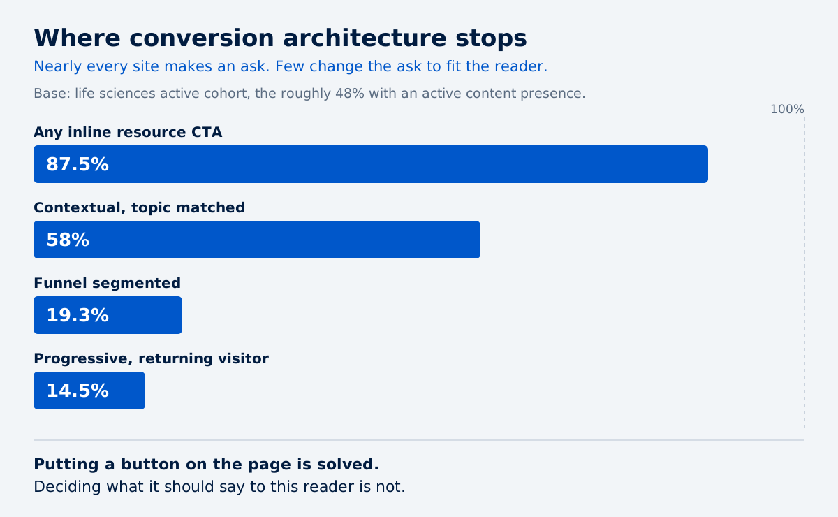
CTA sophistication | Share of active-cohort sites |
Any inline resource CTA | 87.5% |
Contextual, topic-matched CTAs | 58% |
Funnel-segmented CTAs | 19.3% |
Progressive or returning-visitor logic | 14.5% |
Nearly nine in ten sites put an ask on the page. Under one in five change that ask depending on where the reader sits in their buying process, and about one in seven recognise a returning visitor. Segmenting the ask by account and stage is the whole premise of account-based marketing for life sciences.
The drop from 87.5% to 19.3% is the whole finding. Putting a button somewhere is solved across the sector. Deciding what the button should say to this particular reader is not, and it is the usual reason a blog gets traffic and produces no demos.
Three further conversion figures come from the same study.
- Lead-capture form present: roughly 17 in 20 sites
- Content that dead-ends with no next step: about 17%
- Strong conversion paths, scoring 3 or above: about 41%
Two in five sites wire content to a next step well. Three in five do not, and about one page in six ends with nothing at all. The life sciences conversion gap sets those three numbers beside each other.
How mature is life science marketing?
Measured across eight dimensions, life sciences scores highest on knowing who it serves and lowest on getting its content seen.
The scale runs 0 to 4, where 0 is none and 4 is advanced. The study publishes those two endpoints and does not define what a 1, a 2, or a 3 requires, so treat these as a ranking rather than an absolute grade. All eight are mean scores on the active cohort.
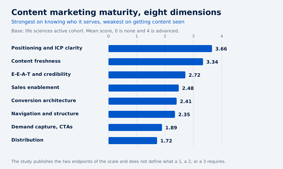
Dimension | Mean score out of 4 |
Positioning and ICP clarity | 3.66 |
Content freshness | 3.34 |
E-E-A-T and credibility | 2.72 |
Sales enablement | 2.48 |
Conversion architecture | 2.41 |
Navigation and structure | 2.35 |
Demand capture, CTAs | 1.89 |
Distribution | 1.72 |
The top of the table reflects an industry where the work itself forces specificity. Nobody selling a cell therapy analytics platform has the option of vague positioning, and it shows. The full life sciences content maturity picture breaks the same eight scores out visually.
The bottom reflects an industry that treats publishing as the finish line.
What credibility signals do life science sites carry?
The study scores E-E-A-T at 2.72 and, in the same section, publishes how often each individual signal appears. It does not state the relationship between the two.
- Named authors: 73.1%
- Original data or research: 71%
- Peer-reviewed citations: 64.8%
- Author bios with credentials: 59.5%
- Expert quotes or interviews: 49.9%
- Formal editorial policy: 3.4%
That last line is the outlier. A published statement of how content gets reviewed for scientific accuracy costs a page of writing and appears on about one active site in thirty, in a sector where the harder credibility signals are already common. Companies that run a formal review process anyway, which is most of pharmaceutical content marketing and much of diagnostics, are declining to say so on the page.
What navigation features are actually in place?
Page-level basics are handled. Reader-level aids are not.
- Clear H2 and H3 headings: 82.6%
- External links and citations: 75.4%
- Resource hub present: 72.2%
- Internal links: 69.2%
- Content categories or tags: 56.8%
- Modern layout aids: 51.8%
- Key takeaways or summary blocks: 11.7%
- Blog FAQ sections: 6.2%
About seven in ten companies now run a proper resource hub rather than a chronological feed. About one article in nine opens with a summary, and about one in sixteen carries an FAQ block.
Those bottom two formats are also the structures answer engines lift most readily, which makes their scarcity a practical matter rather than a stylistic one. The AEO guide covers which structures get quoted, and there is a way to add them without wrecking the page for human readers.
Which scores sit outside that table?
Two further figures circulate from this research and neither belongs in the ranking above.
Regulatory and technical depth, 2.34 out of 4. The study walks this as a dimension but leaves it out of the eight-dimension chart, so ranking it alongside the others would misrepresent the source.
Pipeline friction, 1.34 out of 4. This one is inverted, meaning low is good, and it says the sites themselves are not broken. Read it on its own: friction is low, and what is missing is a path rather than a fix.
How much organic traffic does a life science company get?
Less than most people expect, and with enormous spread inside every revenue band.
These figures come from the pharma and biotech study, measured on a stratified sample of 500 companies.
One sentence decides how you read this table. That sample is drawn from the whole pharma and biotech population, roughly 90% of which publishes no meaningful content. These are medians across an industry that mostly does not publish, so they are not the benchmark for a company that does.
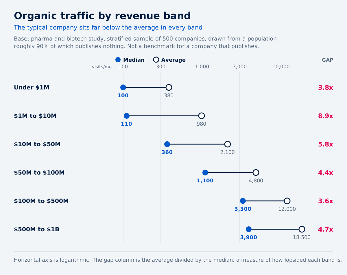
Revenue band | Median visits per month | Average visits per month | Average-to-median ratio |
Under $1M | 100 | 380 | 3.8x |
$1M to $10M | 110 | 980 | 8.9x |
$10M to $50M | 360 | 2,100 | 5.8x |
$50M to $100M | 1,100 | 4,800 | 4.4x |
$100M to $500M | 3,300 | 12,000 | 3.6x |
$500M to $1B | 3,900 | 18,500 | 4.7x |
What the last column means. When an average sits far above a median, a small number of companies are pulling it up while the typical company sits well below. It measures how lopsided the band is, not one company beating another.
Every band is lopsided, and the $1M to $10M band most of all, where the average is nearly nine times the median. Revenue grew through that band and organic performance did not follow it.
For a team benchmarking itself, that spread is more useful than the median beside it. It says the company at the top of your revenue band is not there because of the revenue. Westlab is one worked example of what moving up that distribution looks like for a life sciences supplier, and how life science companies justify and measure marketing spend covers what it costs to get there.
Neither study publishes an organic traffic median for the companies that do publish. So there is a benchmark here for the sector, and none yet for an active content programme. Where the active cohort is concentrated, in CDMOs and CROs and in biotech, the shape of the opportunity is clearer than the number.
What kinds of search queries does life science content rank for?
Informational ones, overwhelmingly.
This table comes from the life sciences study, not from the 500-company pharma sample above. The study does not label a base on it, and its own framing points at the companies that rank rather than at the active cohort. It is a four-part split of ranked keywords by intent and it sums to 100%.
Intent | Share of ranked keywords |
Informational, top of funnel | 68.6% |
Branded, navigational | 20.3% |
Transactional, bottom of funnel | 7.9% |
Commercial investigation, middle of funnel | 3.2% |
About one ranked keyword in five is somebody typing the company's own name. That is a share of keywords rather than of visits, and branded terms usually pull a larger share of traffic than of keywords, so the visit share is likely higher still.
The commercial-investigation slice, the queries somebody runs while actively comparing options, sits at about one keyword in thirty. That slice is where demand capture happens, and the earlier table explains why it is thin: comparison pages exist on 1.8% of sites. The pattern holds across sub-verticals, including medical devices and diagnostics.
How visible is life science content in AI answers?
Almost not at all. This finding also comes from the life sciences study rather than the pharma sample.
Across a set of tested industry queries, 100% returned an AI Overview, and close to none of the analysed companies appeared in those answers. Six sources dominate instead: Mayo Clinic, Cleveland Clinic, Wikipedia, NCBI and NIH, YouTube, and the CDC.
The study does not publish how many queries it tested, so treat that 100% as directional.
The mechanism is not mysterious. Companies that rank on Google and still miss the answer are usually absent from ChatGPT and Perplexity answers for structural reasons, and the difference between a cited brand and an ignored one rarely comes down to size. The life sciences search and AI visibility cut holds the underlying numbers.
What to do with these numbers
Read them as a map of what the sector has not built, not as a target to hit. The scarce formats are scarce everywhere, distribution is the lowest score in the table, and the sector is largely absent from the answers its buyers now read first. Every one of those is available to whoever moves, and the 2026 trends piece covers where the sector is heading next. If you want the underlying dataset rather than the summary, it is in The State of Content Marketing for Life Sciences 2026.
How do your own numbers sit against these benchmarks?
Request a Content RevOps audit and get your content presence, conversion architecture, distribution, and AI-search readiness scored on the same dimensions we scored across the sector.
Frequently Asked Questions
About the Author

Founder & CEO, Content RevOps
Stefan Kalpachev is the founder and CEO of Content RevOps, where he helps B2B SaaS companies transform their content into predictable pipeline. With a background in content marketing and revenue operations, Stefan has developed a unique methodology that bridges the gap between content creation and revenue generation.
Connect on LinkedInRelated Articles
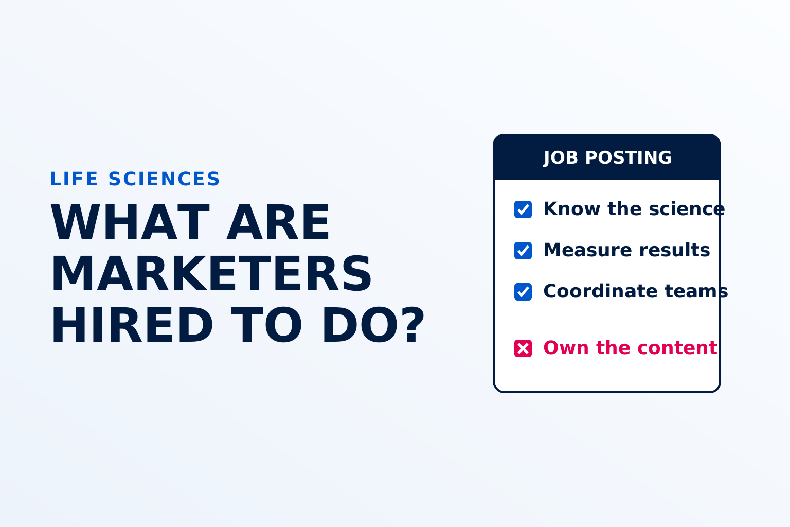
What do life science companies hire marketers to do?
Aug 20, 2026
Life science marketing trends for 2026
Aug 17, 2026
Can You Build a Content Marketing Strategy in One Week? Yes — If You Stop Guessing and Start Collecting Competitor Data
Jun 16, 2026